Control Systems/Bode Plots
Bode Plots
[edit | edit source]A Bode Plot is a useful tool that shows the gain and phase response of a given LTI system for different frequencies. Bode Plots are generally used with the Fourier Transform of a given system.
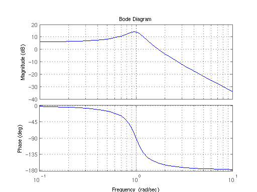
The frequency of the bode plots are plotted against a logarithmic frequency axis. Every tickmark on the frequency axis represents a power of 10 times the previous value. For instance, on a standard Bode plot, the values of the markers go from (0.1, 1, 10, 100, 1000, ...) Because each tickmark is a power of 10, they are referred to as a decade. Notice that the "length" of a decade decreases as you move to the right on the graph. (note that this description doesn't match the chart above... there are 10 tickmarks per decade, not one, but since it is a log chart they are not evenly spaced).
The bode Magnitude plot measures the system Input/Output ratio in special units called decibels. The Bode phase plot measures the phase shift in degrees (typically, but radians are also used).
Decibels
[edit | edit source]A Decibel is a ratio between two numbers on a logarithmic scale. To express a ratio between two numbers (A and B) as a decibel we apply the following formula for numbers that represent amplitudes (numbers that represent a power measurement use a factor of 10 rather than 20):
Where dB is the decibel result.
Or, if we just want to take the decibels of a single number C, we could just as easily write:
Frequency Response Notations
[edit | edit source]If we have a system transfer function T(s), we can separate it into a numerator polynomial N(s) and a denominator polynomial D(s). We can write this as follows:
To get the magnitude gain plot, we must first transit the transfer function into the frequency response by using the change of variables:
From here, we can say that our frequency response is a composite of two parts, a real part R and an imaginary part X:
We will use these forms below.
Straight-Line Approximations
[edit | edit source]The Bode magnitude and phase plots can be quickly and easily approximated by using a series of straight lines. These approximate graphs can be generated by following a few short, simple rules (listed below). Once the straight-line graph is determined, the actual Bode plot is a smooth curve that follows the straight lines, and travels through the breakpoints.
Break Points
[edit | edit source]If the frequency response is in pole-zero form:
We say that the values for all zn and pm are called break points of the Bode plot. These are the values where the Bode plots experience the largest change in direction.
Break points are sometimes also called "break frequencies", "cutoff points", or "corner points".
Bode Gain Plots
[edit | edit source]Bode Gain Plots, or Bode Magnitude Plots display the ratio of the system gain at each input frequency.
Bode Gain Calculations
[edit | edit source]The magnitude of the transfer function T is defined as:
However, it is frequently difficult to transition a function that is in "numerator/denominator" form to "real+imaginary" form. Luckily, our decibel calculation comes in handy. Let's say we have a frequency response defined as a fraction with numerator and denominator polynomials defined as:
If we convert both sides to decibels, the logarithms from the decibel calculations convert multiplication of the arguments into additions, and the divisions into subtractions:
And calculating out the gain of each term and adding them together will give the gain of the system at that frequency.
Bode Gain Approximations
[edit | edit source]The slope of a straight line on a Bode magnitude plot is measured in units of dB/Decade, because the units on the vertical axis are dB, and the units on the horizontal axis are decades.
The value ω = 0 is infinitely far to the left of the bode plot (because a logarithmic scale never reaches zero), so finding the value of the gain at ω = 0 essentially sets that value to be the gain for the Bode plot from all the way on the left of the graph up till the first break point. The value of the slope of the line at ω = 0 is 0 dB/Decade.
From each pole break point, the slope of the line decreases by 20 dB/Decade. The line is straight until it reaches the next break point. From each zero break point the slope of the line increases by 20 dB/Decade. Double, triple, or higher amounts of repeat poles and zeros affect the gain by multiplicative amounts. Here are some examples:
- 2 poles: -40 dB/Decade
- 10 poles: -200 dB/Decade
- 5 zeros: +100 dB/Decade
Bode Phase Plots
[edit | edit source]Bode phase plots are plots of the phase shift to an input waveform dependent on the frequency characteristics of the system input. Again, the Laplace transform does not account for the phase shift characteristics of the system, but the Fourier Transform can. The phase of a complex function, in "real+imaginary" form is given as:
Bode Procedure
[edit | edit source]Given a frequency response in pole-zero form:
Where A is a non-zero constant (can be negative or positive).
Here are the steps involved in sketching the approximate Bode magnitude plots:
Bode Magnitude Plots
- Step 1
- Factor the transfer function into pole-zero form.
- Step 2
- Find the frequency response from the Transfer function.
- Step 3
- Use logarithms to separate the frequency response into a sum of decibel terms
- Step 4
- Use to find the starting magnitude.
- Step 5
- The locations of every pole and every zero are called break points. At a zero breakpoint, the slope of the line increases by 20dB/Decade. At a pole, the slope of the line decreases by 20dB/Decade.
- Step 6
- At a zero breakpoint, the value of the actual graph differs from the value of the straight-line graph by 3dB. A zero is +3dB over the straight line, and a pole is -3dB below the straight line.
- Step 7
- Sketch the actual bode plot as a smooth-curve that follows the straight lines of the previous point, and travels through the breakpoints.
Here are the steps to drawing the Bode phase plots:
Bode Phase Plots
- Step 1
- If A is positive, start your graph (with zero slope) at 0 degrees. If A is negative, start your graph with zero slope at 180 degrees (or -180 degrees, they are the same thing).
- Step 2
- For every zero, slope the line up at 45 degrees per decade when (1 decade before the break frequency). Multiple zeros means the slope is steeper.
- Step 3
- For every pole, slope the line down at 45 degrees per decade when (1 decade before the break frequency). Multiple poles means the slope is steeper.
- Step 4
- Flatten the slope again when the phase has changed by 90 degrees (for a zero) or -90 degrees (for a pole) (or larger values, for multiple poles or multiple zeros.
Examples
[edit | edit source]Example: Constant Gain
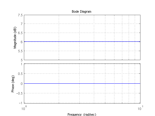
[edit | edit source]Draw the bode plot of an amplifier system, with a constant gain increase of 6dB.
Because the gain value is constant, and is not dependent on the frequency, we know that the value of the magnitude graph is constant at all places on the graph. There are no break points, so the slope of the graph never changes. We can draw the graph as a straight, horizontal line at 6dB:
Example: Integrator
[edit | edit source]Draw the bode plot of a perfect integrator system given by the transfer function:
First, we find the frequency response of the system, by a change of variables:
Then we convert our magnitude into logarithms:
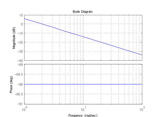
Notice that the location of the break point for the pole is located at ω → 0, which is all the way to the left of the graph. Also, we notice that inserting 0 in for ω gives us an undefined value (which approaches negative infinity, as the limit). We know, because there is a single pole at zero, that the graph to the right of zero (which is everywhere) has a slope of -20dB/Decade. We can determine from our magnitude calculation by plugging in ω → 1 that the second term drops out, and the magnitude at that point is 6dB. We now have the slope of the line, and a point that it intersects, and we can draw the graph:
