Usability for Nerds/Novices versus experienced users
Novices
[edit | edit source]New users that haven't seen your product before need guidance on how to use it. The best guidance may be a self-explaining design that shows what the apparatus can do. If it is a machine then there should be a button or handle for every function. Each button or handle should have a text or an icon telling what it does. If there are many functions then they may be organized into logical groups. There should be no invisible or hidden functions that a normal user would need.
In the case of software, the most popular form of self-explaining design is a menu. The items in the menu should be self-explaining so that the users know immediately which options they have. The user can now click, push or touch the desired item in the menu. A menu with many options should be structured into sub-menus, each representing a logical category. A hierarchical menu should preferably not have more than four or five levels.

Other things you can do to help new users:
- Help facilities. A button or menu that gives access to help instructions should be visible everywhere in the program. There should be search facilities so that the user can search for help on a particular topic.
- Context help. A facility that gives instructions about the specific part of the program that the user is in or a specific object that the user is pointing at.
- Fool-proof. Useless or dangerous combinations of commands should be prevented or organized so that they cannot be done by mistake.
- Ask for confirmation. The program should ask the user for confirmation before carrying out a command that has far-reaching consequences or cannot be undone.
- Regret. There should be Cancel and Undo facilities to allow the user to regret their actions. In some programs it is useful to have the possibility to undo several steps back.
Experienced users
[edit | edit source]The heavy users who have to do the same tasks hundreds of times a day will find it annoying if they have to click their way through a lot of icons or sub-menus every time they do a simple task. Not only is this time-consuming - heavy use of the mouse also causes strain injuries which in the worst case can permanently disable a user.
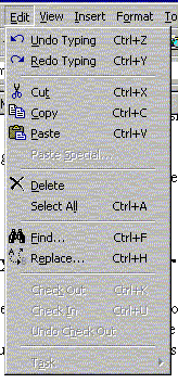
Therefore, there should be shortcut keys for all common commands. Pressing Ctrl+C or Ctrl+Ins is definitely faster than clicking the Edit menu and then clicking Copy on the sub-menu. It is also more convenient because the user doesn't have to move their hand and eyes from the keyboard to the mouse and back again.
The user should be encouraged to use these shortcut keys. A nice way of doing this is to write on the menu which shortcut key the user could have pressed instead:

A user who has discovered the advantage of shortcut keys will soon remember the key combinations for the commands they use the most, while they may still use the menu for seldom used commands. Note that the menu shown above has a third way to the commands: The underlined E in Edit means that this menu can be activated by pressing Alt+E.
Some systems allow the user to modify the system to suit their needs. This is called customization. If there is a special command that the user often uses then it is nice if the user can assign a special key combination to this command. Furthermore, the user may define a macro for a long sequence of commands or a phrase that they often need.
Some systems have a lot of menus, icon bars, rulers, status lines, etc. that take up screen space. The user should have the possibility of deciding which of these they want and remove the rest.

This picture shows an example from an office program where the user has to search through a bewildering array of commands and incomprehensible icons in order to insert a cross reference. There is a mouse-over popup text explaining each command, but there is no indication of any shortcut key that can facilitate the work if the same command is used often.
Which user should I optimize for?
[edit | edit source]The ideal design should of course be suitable to both novices and experienced users. And the customization principle makes this possible in most cases.
There are certain cases where you should pay extra attention to the needs of new users:
- Barrier to first use. There is a limit to how much time and energy a user is willing to spend on learning to use a new apparatus or a new piece of software. If the user doesn't have success after a few tries then they may give up and never come back.
- Web sites. A high proportion of the visitors to a website are likely to be first-time users. They are probably not willing to read any instructions before using the facilities on the website. Therefore, you should resist the temptation of designing a fancy graphical menu that the user can't see is a menu or can't guess how to use. All menus should be self-explaining and have a familiar design.
- Public places. Machines in public places for public use have many first-time users. Examples are vending machines, payphones, fire alarms, and information screens in train stations and airports. Such appliances should be designed so that they can be used by anybody, including children, disabled persons, and foreign tourists. Standardization and self-explaining design are important here. If there is a screen with text it may be useful with flags to touch for selecting the language.
- Serious consequences. If faulty operation of a machine has serious consequences then you should pay special attention to the usability. Examples are medical equipment and dangerous machines.