Usability for Nerds/Design should reflect the user's logic, not the constructor's logic
A friend of mine once had a very unfortunate experience with a popular database program. He was working for a non-profit organization and wanted to delete a few persons from the membership file. He did the same commands as he had done many times before, but rather than deleting the selected persons the program deleted the addresses of all 5000 members! When he clicked the undo command the program said that this operation was too big to undo. Need I say that he was terrified...
As my friend had been using this database every day for more than a year, I decided to investigate the program to find out how it was possible for such an experienced user to make such a fatal mistake. The database program was part of a complete package of office programs, including word processor, database, spreadsheet, calendar, etc. The designers of this office package had clearly emphasized to give the different programs in the package a similar user interface. Specifically, the database looked very much the same as the spreadsheet. There was a row for each record and a column for each field, as shown in this figure:

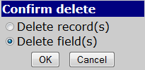
To delete a few records, my friend highlighted the unwanted persons, as shown above, and clicked Delete. The program, not knowing whether he wanted to delete the selected rows or the selected columns, presented a dialog box that looked something like this:

My friend had seen this box many times before, and the program had always made a default selection at Delete records, so that he only had to press the OK button. But for some reason, the program this time made the selection at Delete fields, which he didn't notice. When the OK button was pressed, the program did not delete the selected records, but the selected fields for all 5000 records.
Now, let's analyze this problem from a usability point of view. The programmers had decided to give all programs in the office package a similar user interface - good idea. To make the database and the spreadsheet program look similar, they had decided to present the database as rows and columns. This makes good sense to the user. It makes less sense that you can select a rectangular area covering parts of more than one record as illustrated above. But the core of the problem is that deleting a row and deleting a column are treated as similar operations. This is perfectly OK for a spreadsheet, but certainly not for a database. Deleting a row means deleting a record; deleting a column means changing the basic structure of the database. From the user's point of view, these are certainly not similar operations.
The unfortunate event in this example illustrates very well the principle I want to explain here: that the design should reflect the user's logic, not the constructor's logic. From the programmer's point of view, deleting a row and deleting a column are equivalent operations. But from the user's point of view they are fundamentally different. Deleting and creating records in a database is an everyday task. Deleting and creating fields is something you do when you define the basic structure of your database. Probably, this is done only once when you start to make a database. Furthermore, these two operations may not be done by the same persons. Typically, the setting up and definition of a database is done by a technician, while the everyday task of creating and deleting records is done by a secretary. Therefore, the commands for defining or modifying the structure of the database should be put away in a separate part of the user interface where they cannot be confused with the more common commands for modifying records.
Generally speaking, operations that represent different working situations to the user should be kept in different parts of the user interface.