International Postage Meter Stamp Catalog/Costa Rica
Costa Rica
[edit | edit source]The first meter appeared in 1938. All stamps contain COSTA RICA in the frank. The stamps are grouped according to appearance:
- A - Upright straight-sided rectangle with country name in curved panel above the value figures
- B - Straight-sided rectangle without arced inner panel
- C - Horizontal rectangle enclosing the TM as well as the frank
- D - Rectangle with simulated-perforation border
- E - Open design without outer border
GROUP A: Upright frank with “COSTA RICA” in curved panel near top”
[edit | edit source]

A0.1. Universal “MultiValue” (MV), 1938. [Extremely rare, only two mailed examples known. Proofs are not as rare.]
- Frank 25 x 31 mm (width excluding curved panel).
- “CORREOS” at top "CENTAVOS" at bottom.
- M# “U.1” prefix below "CENTAVOS".
- Value figures angular.
- TM: DC
- V/F:
 000
000
NOTES: This stamp was previously thought to be an essay until a mailed example turned up in 2012. The “CENTAVOS” version was used prior to the "CENTIMOS" version (type A1).

A1. Universal “MultiValue” (MV), 1940. [Scarce]
- As Type A0.1 but with "CENTIMOS" replacing "CENTAVOS".
- M# with “U” prefix.
- Value figures angular.
- a. Printed in brown [One reported]

A2. Pitney Bowes-GB “Automax” (MV), 1960.
- Very similar to Type A1, but shorter frank with “COLONES” above M#.
- Without “POST PAID”. M# with “P.B.” prefix.
- TM: DC
- V/F: =0.oo


A3. Postalia “D2” (MV), 1957.
- Similar to Type A1B but curved panel is contained within the side borders.
- Value figures are small, narrow and oval.
- M# with “P” prefix.
- A. Wide spacing between TM and frank
- B. Narrow spacing between TM and frank
- TM: DC
- V/F: 000

A4. Neopost “105” (LV6), 1947. [Very scarce]
- Small frank with straight outer frame lines excepting curved panel containing country name extending outward.
- Frank is 19 x 25 mm excluding the curved panel.
- "POST PAID" below curved panel.
- Wide spacing between TM and frank.
- M# with “N” prefix.
- TM: DC
- Values seen:
- CENTIMOS: 3, 5, 10, 15, 25, 40
- COLON: 1
- Values seen:
- a. Examples used without town mark are government Official stamps.

A4.1. Satas "Baby" (MV). [Appears to be quite scarce]
- Similar to Type A4 but the frank is wider, and the date and value figures are tall.
- The curved panel containing "COSTA RICA" extends farther outside the sides of the frame.
- "PORTE PAGANO" below curved panel.
- Meter number with "PERMISO No. S" prefix.
- TM: SC
- V/F: 0.00

A5. Satas “Rotary” (MV). [Very scarce]
- Post Office stamp.
- As Type A4.1 but narrower frank.
- Date and value figures short.
- ”PERMISO NO.” below “CENTIMOS” at bottom.
- "POSTA PAGADO" below curved panel.
- TM: SC
- V/F: 0.00

A6. Pitney Bowes-GB “Simplex” (LV-25), 1958. [Scarce]
- Frank 24 x 27 mm with curved panel contained within the side borders.
- M# with “P.B.” or “S” prefix.
- A. With “COLONES” and “S” prefix
- B. With “CENTIMOS” and “S” prefix
- C. With “CENTIMOS” and “P.B.” prefix
- TM: DC
- Values seen:
- COLONES: 0.05 to 1.25 in 5₡ increments
- CENTIMOS: 5 to 125 in 5c increments
GROUP B: Frank is straight-sided rectangle without curved inner frame
[edit | edit source]


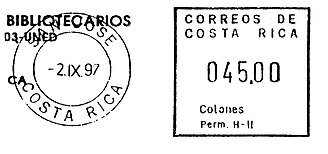
- B2. Hasler “Mailmaster” (MV).
- Frank is large, simple square with “CORREOS DE/ COSTA RICA” at top and “Colones” above P# at bottom.
- P# with “Perm. H” prefix.
- TM: DC
- V/F: 000.00

- B3. Neopost “Electronic” (MV).
- Frank with double line border broken at bottom by M#.
- “COLONES” above M#.
- M# with “RA” prefix.
- TM: DC
- V/F: ≋0.00

- B4. Neopost “Electronic” (MV).
- Frank with double line border broken at bottom my M#.
- “CORREOS de la REPUBLICA de” in two lines at top.
- "COSTA RICA" above M#.
- M# with “RA” prefix.
- TM: DC solid
- V/F: ≋0.00
GROUP C: Horizontal rectangle enclosing the town mark as well as the frank
[edit | edit source]

C1. Hasler “F88” (MV), 1953. [Very scarce]
- Mountain and village scene at bottom right and “REPUBLICA DE/ COSTA RICA” at top.
- “CORREOS/ PERMISO No.” below TM.
- TM: SC
- V/F: 000


- C2. Postalia “D2/D3” (MV). [Scarce]
- Statue of soldier between TM and value figures.
- “COSTA RICA” at top, “CENTS” vertical at right.
- M# with “P” prefix at bottom.
- A. Frank 58-60 mm wide
- B. Frank 66-67 mm wide
- TM: SC
- V/F: 000


C3. Hasler “F88” (MV).
- Map of country and compass between TM and value figures.
- “REPUBLICA DE/ COSTA RICA” at top.
- “CORREOS/ PERMISO NO. (P#)” below TM.
- A. Dot at right side of map. M# 26, (Limon) [Very scarce]
- B. Dot at left side of map. M# 24, (Puntarenas) [Very scarce]
- TM: SC
- V/F: 0,00
- NOTE: The compass on C3B has “E” (east) at left and “O” (west) at right. This is a mistake.
GROUP D: Frank is rectangle with simulated-perforation outer border
[edit | edit source]

D1. Francotyp (MV). [Scarce]
- Horizontal frank inscribed “COSTA RICA” at top, the right portion of coat of arms at left.
- “PERM No (P#)” at bottom.
- P# with “F” prefix.
- TM: DC
- V/F: 0,00
- a. Printed in black

D2. Francotyp "Cc” (MV). [Scarce]
- Upright rectangle with three straight vertical lines at left and two vertical lines at right.
- “PERMISO / No (P#)” at bottom.
- P# with “F” prefix.
- TM: DC
- V/F: 0,00
 0,00
0,00

D3. Francotyp-Postalia (MV).
- As Type D2 but with two vertical lines at both sides.
- “PERMISO / No (P#)” at bottom.
- P# with “F” prefix.
- TM: One example seen with date but no TM
- V/F: 0000.00
GROUP E: Open design without complete outer border
[edit | edit source]

E1. Pitney Bowes “R” (MV).
- Inscribed “CORREOS DE LA REPUBLICA de” across top and “COSTA RICA” above the value figures.
- National monument design below an arc of five stars between TM and value box.
- P# with “P.B.PERM.” prefix below monument.
- TM: SC
- V/F: ≋00 :

E2. Pitney Bowes “DM” (LV-21).
- As Type E1 but much narrower with “COSTA” above “RICA”.
- P# with “PB” prefix.
- TM: SC
- Values: 01 to 21

E3. Pitney Bowes “5300” (MV).
- Similar to Type E1 but design is wider and value box has top and right side lines.
- P# with “P.B. PERM” prefix.
- TM: SC
- V/F: ≋0.00

E4. Pitney Bowes-GB “5000” (MV).
- Similar to Type E3 but the top inscription does not extend above the TM at left.
- The value box is a complete rectangle.
- P# with “P.B. PERM” prefix.
- TM: DC
- V/F: ≋0.00


E5. Pitney Bowes-GB “5000” (MV).
- As Type E4 but with horizontal lines instead of the arc of stars above the monument at center.
- Value box broken at lower left by the P#.
- P# with “P.B. PERM” prefix.
- TM: DC
- A. Value box 19 mm wide. V/F: ≋0.00
- B. Value box 22 mm wide. V/F: ≋00.oo

E6. Pitney Bowes-GB “6300” (MV).
- Unlike previous Group E types, the date and value figures are on the same level.
- The P#, with “P.B. PERM.” prefix, is below the value figures rather than the central monument.
- Value box with lines at right and bottom only.
- A. Inner line below value figures unbroken
- B. “COLONES” breaks inner frame line below value figures
- TM: DC
- V/F: ≋0.00 ≋00.oo

E7. Pitney Bowes-GB “A900” series (MV).
- Frank without frame line except below value figures.
- Wide design with relatively large value figures.
- “COLONES” below value figures.
- M# breaks bottom frame line.
- TM: DC
- V/F: ≋0000.oo
GROUP PO: Stamps from machines in Post Offices
[edit | edit source]

PO1. Epelsa “RL-Postal” (digital), 2002.
- Self-adhesive label with wavy edges.
- Multi-color design picturing a canoe on Manzanillo Beach.
- Below the image are two lines of text added at point-of-sale, in small letters a machine ID number and the post office name above the date and value figures.
- V/F: ₵


 0
0


PO2. Epelsa “RL-Postal” (digital), 2003.
- Self-adhesive label with wavy edges as with PO1, but the stamp is much wider.
- Normally without post office name showing only a machine number above the date and value figures.
- a. With post office identification above the value figures
NOTES:
- The system produces a registration number label, shown at at right, as well as postage stamps.
- Besides the designs with red frog on green leaf and the fish with scuba diver shown above, six other designs were issued between 2004 and 2010: green frog with red eyes, volcano erupting, volcano crater, ox cart and people, school of blue fish, sea turtle on the beach. These designs are pictured on the ATEEME web site, http://www.ateeme.net


PO3. Epelsa “RL-Postal” (digital), 2012.
- As PO2, but with postal service logo rather than a landscape or wildlife image.
- The value figures are different from PO2.
- Two different designs have been issued, one in 2012 and the other in 2013, both in green and blue and with point-of-sale data added in black.
- A1. Label with double ribbon across the top, post office identification added in the center.
- A2. As A2 but with weight, date, time and other data above and to the left of the value figures.
- B1. Label with stepped bar across the middle, post office identification added in the center.
- B2. As B1 but with weight, date, time and other data above and to the left of the value figures.
- V/F for A1 and B1:
 000,00
 - V/F for A2 and B2:
 ₵0
₵0


PO4. Probably Epelsa (digital), 2016.
- Similar to Type PO3, but with different underprint design including square 2D barcode field at upper right.
- Point-of-sale data much smaller than with PO3.
- V/F:
 ₵0
₵0


