GIMP/Add Speech Bubbles to a Comic Strip
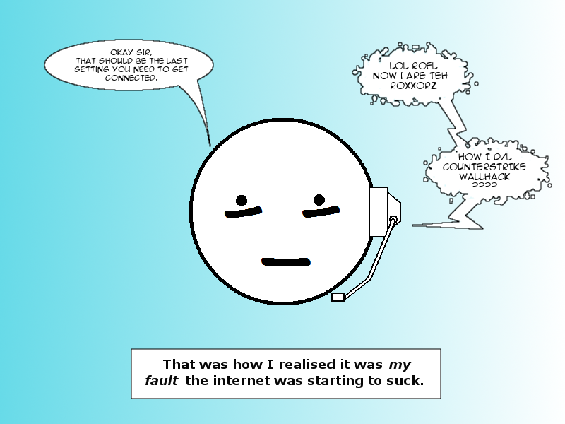
This tutorial will show you how to add text and speech bubbles to pre-made art in The GIMP v2.0 or later.
Getting started
[edit | edit source]Make a copy
[edit | edit source]This step isn't strictly necessary, but it's a good idea that could save you from repeating steps if something goes horribly wrong. It's a very good idea if you're working on the only copy of your source image.
(Better yet, don't work on the only copy of your source image.)
When you open an image in The GIMP, it automatically becomes the background layer. Anything added to the image will be added as a higher layer, sitting above the background layer. You can combine layers by clicking Layers > Merge Down, and you'll probably want to at some stage, so you can work on multiple added items at the same time.
Right-click the Background' layer and select Duplicate. That way, if you accidentally merge the wrong layer down onto a lower one, or perform an operation that seems like a good idea but isn't (and can't be rolled back), you haven't overwritten the only copy of the art you have.
Add a filter
[edit | edit source]You'll most likely be adding text in black. If the background is dark as well, the text will be almost invisible and difficult to work with. You can make it easier to view dark text on a dark background by adding a semi-opaque layer between them in a light colour. To do this:
Click Layers > New Layer and select a transparent background.
To add the filter, select the Fill tool and select white as the colour to use. Reduce the opacity to 50% and click anywhere on the new layer. You'll see the image turn milky, because you're now viewing the background image through a semi-transparent white layer. Any text you lay down on top of this will be easy to see, and after you've added the speech bubbles around it, the filter can be removed, leaving the background looking like it did to begin with.
Text
[edit | edit source]Adding the text
[edit | edit source]To select the Text tool, press T. Select the colour, font and size you prefer. Use anti-alias should be ticked. Jagged edges on your text will make it harder to read, especially if the image is resized. Centre-aligned text is often best, too.
Positioning
[edit | edit source]After the text box is closed, the text tool automatically changes to the Move tool. At this point, if you try to move the text, you'll see it slide out of the box and vanish completely off the edges of the layer. Since you probably do want to move the text, to get it positioned just right, you'll want to expand the layer to the full size of the image. To do this:
Click Layer > Layer to Image Size.
Now you can select your text with the Rectangular selection tool. As soon as the mouse is released, the selection tool changes to the Move tool and you can simply drag your text to where it needs to be.
Combining styles
[edit | edit source]The GIMP text tool applies a single style to an entire block of text, so an example of what you can't do is bold or italicise individual words. (In other words, the previous sentence would be impossible.) To mix styles, add all the text of one style in a single layer, taking care to leave the space for the other styled text, then add a second text layer written in the second style, positioning it over the first.
Bubbles
[edit | edit source]Background
[edit | edit source]Once you have all the necessary text on the screen and in the right position, you can create the bubbles. First, add a new layer, below the text layer. This part of the process will involve painting out a section of the current layer, so if it's the same layer your text is on, you'll lose it.
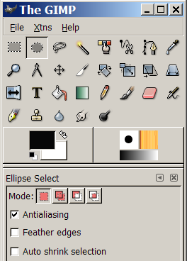
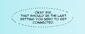
Next, change to the Elliptical selection tool. Once again, make sure to anti-alias. Draw an oval around the text, making sure to leave enough white space so the text isn't crowded. This will become the bubble.
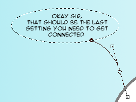
To add a stalk pointing to a character, change to the Path tool. (The GIMP's Path tool mirrors the Photoshop Bézier Curve tool.) This allows you to mark out an area to be added to the selection you made with the Ellipse tool.
First, click and release the mouse on a starting point just inside the oval. Next, click where you want the point of the stalk to be. If you want a straight line, release and continue to the next step. If you prefer a curve, hold the mouse button down and drag the pointer away from the second point. The line will deform into a curve. It'll take a bit of experimentation to get it exactly where you want it, but it's a nice effect.
Click back into the oval to complete the other side of the stalk. Now you have an oval around the text, and on top of that, a stalk.
Move back to the dialogues window again, and click the Paths tab. Right-click the uppermost path on the stack and select Add to selection.
Now the entire speech bubble including the stalk will have the blinking dashed line around it.
At this stage, you can experiment a little bit to add some variety among the different speech bubble shapes you have. For instance, the script-fu menu's selection options offers the distress selection tool, which will make the outline a bit more random.
Finally, select an appropriate background colour (white is the classic) and then the Fill tool again. (Make sure you raise the opacity back to 100% unless you prefer the speech bubble to be semi-transparent on top of your background image.) Click inside the selection and it will fill with the selected background colour out to the edges. Your text should now be invisible behind the background colour. Don't try working with the text or any other task yet, because you still need the speech bubble selected.
Border
[edit | edit source]Now that you have the speech bubble filled, you can add a black (or any other colour) border to it. To do this, first select a foreground colour and then:
Click Edit > Stroke selection....
The default line thickness is 6 pixels, which is probably too thick. 1px or 2px should be plenty. Click to confirm, and a border in the selected foreground colour will appear around the speech bubble.
In order to create a smoother border, first click Select > To Path. Then, click Edit > Stroke Path.... Proceed as stated in the previous paragraph.
Cleaning up
[edit | edit source]Text in bubble
[edit | edit source]Now that you have speech bubbles, you want the text in them. To accomplish this, go back to the layers window. There's probably a whole range of layers by now, since each block of text and each speech bubble you created added one (or more) new layer. Use the mouse to drag the speech bubble layers below the text layers and you'll see the words appear in the bubbles.
Removing the filter
[edit | edit source]Using the mouse on the layers window, select the semi-opaque layer you created. Right-click and select Delete. You'll see the background image snap back to its original colours behind your speech bubbles.
Saving your work
[edit | edit source]If you want to keep the different elements of the image on the separate layers, you'll need to save the image as a .xcf file, which is The GIMP's native file format. To save it in a format you can view in a browser or slideshow program, select the appropriate extension when you save the image and confirm that the file should be exported, (losing the separation between layers in the process).
General practices
[edit | edit source]We naturally start reading at the top left-hand corner of a box and proceed towards the bottom right. The first words spoken should be higher and further towards the left unless you have some other way in addition to speech bubble stalks of making it clear which character is speaking.
Dark text on a light background is easiest to read. Text and background should never have the same brightness even if they're different colours, since it makes it harder for the eye to distinguish between them. and in general the text should have the 'richer' colour (e.g. red, blue, green) and the background should be a 'washed-out' colour (e.g. white, grey, pale blue).
Start big. It's easy to scale large images down, small images scaled up will tend to be pixelated and won't look as good.
Don't crowd your images with too much talk. Text should give way to art rather than vice versa.
Adding thought bubbles
[edit | edit source]So far a very effective way of adding speech to your work has been showcased. Now it's time to get thinking!
Tailoring the text to your preferences
[edit | edit source]A quick note on tool-usage that seems to pass people by:
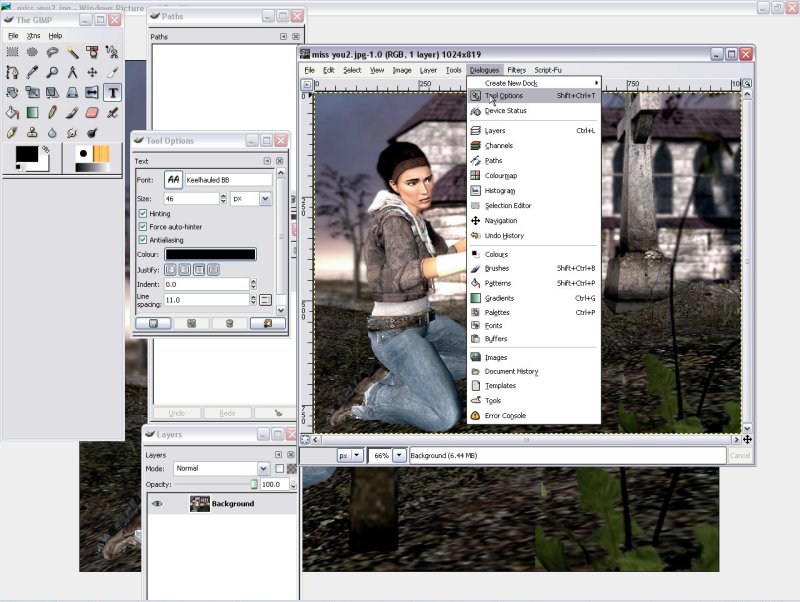
You must open the Tool Option dialogue and use it as above to get the best out of GIMP. In this case the text editor is selected, but you also need it to use all GIMP tools effectively. It is important in the next section.
Creating the Bubble
[edit | edit source]Now what you must do is select the tool options as in the screenshot above. This is essential if you want to follow the rest of this tutorial as you will be using it a lot to make sure everything is working correctly. In this instance the Text tool is selected so you can work on all the options such as the font and text size as well as the text justification. This is essential.
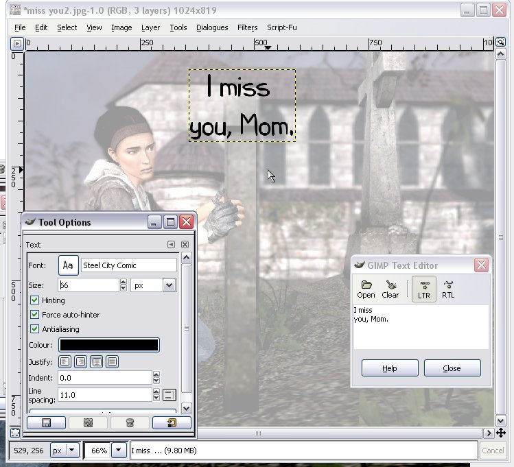
Now you need to type in your text as for the speech bubble tutorial. So far all is the same. Note: I have used the same sort of filter as in the earlier tutorial.
Time to add the selections for the bubble. As before select the elliptical marquee tool.
However, this time you need to select the option in the screenshot above from the Tool Options dialogue. This will allow you to draw the several ellipses necessary to create a thought bubble without cancelling the selection each time you click away from it.
After this just fill and stroke as for speech bubbles, move stuff around to your satisfaction, remember to delete the filter and - one thought bubble!


