File:United States black by county 1880.gif
Jump to navigation
Jump to search
No higher resolution available.
United_States_black_by_county_1880.gif (549 × 519 pixels, file size: 101 KB, MIME type: image/gif)
|
|
This is a file from the Wikimedia Commons |
Summary
| Description |
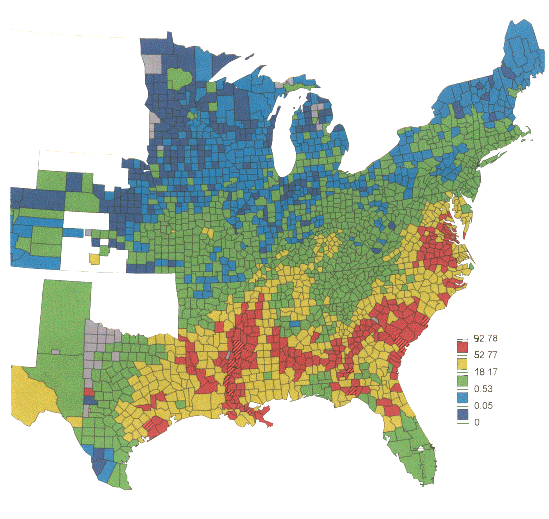
English: Distribution of the black population in the U.S. after the Civil War. The red areas represent counties in which blacks were a majority of the population in 1880. The distribution of blacks reflects the places where slavery had been most entrenched: eastern Virginia and N. Carolina, S. Carolina, the "black belt" running across Georgia and Alabama, and the Mississippi River.
These maps were produced using The Great American History Machine (ePress Project, 1994), which enables the user to map census variables and election returns by county from the 19th century through 1984. The unnatural break points in the legend reflect the software's programming: each range (e.g., 0.53-18.17% for green) covers 1/5 of all counties in the U.S. (Western counties omitted in this presentation). |
| Date | |
| Source | http://www.umich.edu/~lawrace/ |
| Author | Elizabeth Anderson and Jeffrey Jones |
Licensing
This file is licensed under the Creative Commons Attribution-Share Alike 4.0 International license.
- You are free:
- to share – to copy, distribute and transmit the work
- to remix – to adapt the work
- Under the following conditions:
- attribution – You must give appropriate credit, provide a link to the license, and indicate if changes were made. You may do so in any reasonable manner, but not in any way that suggests the licensor endorses you or your use.
- share alike – If you remix, transform, or build upon the material, you must distribute your contributions under the same or compatible license as the original.
File history
Click on a date/time to view the file as it appeared at that time.
| Date/Time | Thumbnail | Dimensions | User | Comment | |
|---|---|---|---|---|---|
| current | 16:37, 10 January 2015 | | 549 × 519 (101 KB) | MartinPoulter | User created page with UploadWizard |
File usage
The following page uses this file: