Travel Time Reliability Reference Manual/Other travel time reliability plots
TTRMS analysis tool can also provide user the observed frequency of each of the non-recurring factors. Figure 1 is an example of observation along I-94 Westbound from downtown St. Paul to downtown Minneapolis. This represents the number of fifteen-minute intervals throughout the year that have these factors present in the database. In this example, 60 percent of the time intervals do not have any non-recurring factors present, i.e. normal conditions. The intervals with a single factor observed, such as weather, crash, incident, event or roadwork, range from one percent to ten percent of the intervals. Time intervals with two or more factors present are shown in the combinations category and were observed in nine percent of the time intervals in 2012.
Figure 1: 2012 WB I-94 Observation Pie Chart
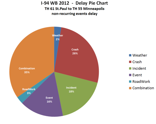
Figure 2 shows the delay experienced during each of the regimes. To calculate this, the average delay for each time period (observed travel time minus free-flow travel time) is multiplied by the number of users during that time period. All of the time periods are then separated by regime to establish the proportion of delay experienced under each condition. Comparing this chart to Figure 1 shows that a disproportionate amount of the delay is experienced during times with non-recurring factors present, indicating that these factors contribute to increased delay on the corridor.
Figure 2: 2012 WB I-94 Delay Pie Chart
However, there is an argument that a portion of the event delay was likely due to normal delay but not caused by the specific event. For example, 15 percent of crash delay is derived in the example stated above. The right interpretation of the number is that 15 percent of delay is observed during crash time. It cannot be explained as 15 percent of delay is caused by crash because normal delay is included in the 15 percent. TTRMS tool can also provide an adjusted delay pie chart that represents the particular event delay. The basic methodology TTRMS tool applied is to subtract the average normal delay in the specific time when events occurred from the observed delay during events. For example, if a crash lasted for 30 minutes, and the observed corridor delay is 1,000 hours, and the average normal congestion delay is 400 hours, the adjusted delay for this particular crash is 600 hours (1,000 hr- 600 hr) rather than 1,000. However, if a crash lasted for 30 minutes, and the observed corridor delay is 1,000 hours, and the average normal congestion delay is 1,400 hours, the adjusted delay for this particular crash is 0, which indicates that the specific crash does not cause delay at all. Figure 3 shows the adjusted delay pie chart. Comparing with Figure 2 that displays the observed delay pie chart, all of portions for non-recurring events decrease. This chart is more accurate if user would like to analyze the association between the delay and specific types of events.
Figure 3: 2012 WB I-94 Adjusted Delay Pie Chart
Figure 4 shows the delays caused by non-recurring events only along I-94 Westbound from downtown St. Paul to downtown Minneapolis. This chart shows the same things with Figure 3 except excluding the normal congestion delay.
Figure 4: 2012 WB I-94 Adjusted Delay Pie Chart for non-recurring events


